The average person encounters thousands of ads and corporate logos per day. Embedded within these designs is the deliberate placement of rhythm, color, and light that work in profound ways within the subconscious human mind. And, people rarely consider the potent effect these patterns have on their purchasing habits and even the ideologies that they accept.
Additionally, what often escapes us are the occult origins of many of these symbols. When confronted with such symbols, we assume that they are mere trivial and shallow designs, the somewhat arbitrary products of graphic designers trying to appeal to customers. Many people are unaware of the deeper, often astrological, meanings behind these sigils.
These occult symbols are used in advertising with good reason. They speak to us on a deep emotional and psychological level and the folks in the marketing departments are certainly well-aware of that. The following is a list of some of the most popular motifs used in corporate advertising.
10. Ram Horns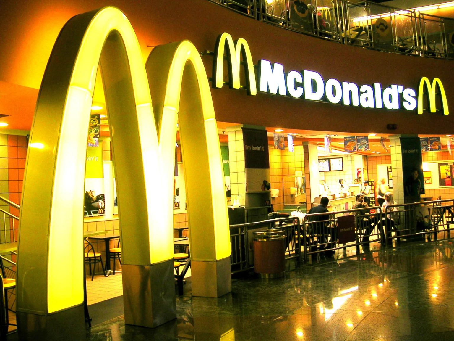
Most people never consider the meaning of the familiar golden arches of McDonald’s because it’s just a giant M, right? This fast-food logo is actually a prime example of Aries symbolism at work. In astrology, Aries is the first house of the zodiac and this archetype of the ram is ruled by the planet Mars— the god of war.
The reason for the popularity of the ram horns symbol is that the Fire sign Aries is representative of action, willpower, excitement, and passion— qualities that incite the act of making a purchase. The colors associated with Mars and Aries are usually red, yellow, and black. Incidentally, warm colors such as red and yellow are known by psychologists to stimulate hunger and a sense of urgency. It’s safe to say that the ad people at McDonald’s made an excellent choice in crafting the color scheme for their logo, as do many other fast-food logo designers.
The first month of the astrological year is the month of Aries and this concept of the first month of the year shows up in the names of other corporate entities that use Aries symbolism in their logos— Mazda and Nissan. These car companies’ names mean “first month of the year” in their respective languages and they both use either the ram horns or the Mars symbol in their designs. Yet another car brand that uses the ram horns in their logo is Dodge Ram. These car companies are trying to show us that our inner warriors will be ignited when we drive their vehicles.
9. The Bull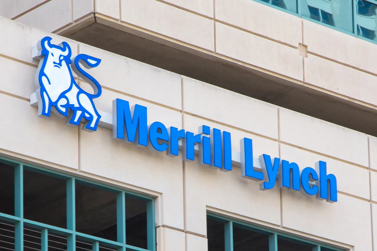
The second constellation and house of the astrological year is Taurus, the bull. In astrology, this zodiac sign is ruled by the planet Venus, which tends toward love, attraction, abundance, and material resources.
Since Taurus is a sign involving wealth and prosperity, corporations like Merrill Lynch capitalize on that idea by using the symbol of the bull in their logo. What they are trying to communicate is that customers’ finances will be in good hands by doing business with them.
Another meaning of the Taurus bull is patience and steadfastness. The bull is a slow-moving grazing creature. It is for this reason that Red Bull and Lamborghini use the bull in their logos. Red Bull’s message to consumers is that we may emerge energized from our slow and lethargic state by drinking their product. Lamborghini is telling us that we might become as stimulated as a Spanish bullfighter by driving their sports cars.
8. The Maiden
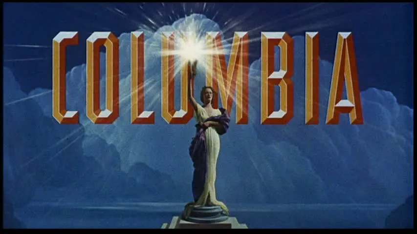
What do Columbia Pictures, Columbia Records, and Arista Records all share in common?—Virgo symbolism. Virgo, the maiden or the virgin archetype, is the sixth sign of the zodiac. It is an Earth sign ruled by the intelligent planet Mercury and the messenger of the gods, Hermes.
As an Earth sign, the virgin maiden is an archetype of good nutrition, health, daily work, and routines. It’s also related to the end of summer and harvest season. This is why the Virgo maiden is often depicted holding a bundle of wheat. Many health food products use variations of Virgo symbolism in their logos. Some of which are the Gaia or Mother Earth symbols.
As a Mercurial sign, the maiden is related to analytical thought processes and the distribution of messages from higher realms. Columbia Pictures thoughtfully selected the image of the maiden for use in their branding to convey their ostensible role in distributing such glorious messages. Even the use of the word Columbia is associated with this innocent archetype of the virgin because, in its etymological roots, it means dove, a symbol of love, innocence, and purity. Arista records also picked up on this idea by using the word Arista in their brand. Arista (or Spica) is the brightest star in the Virgo constellation. These media corporations purport to be sending us an important message through the maiden.
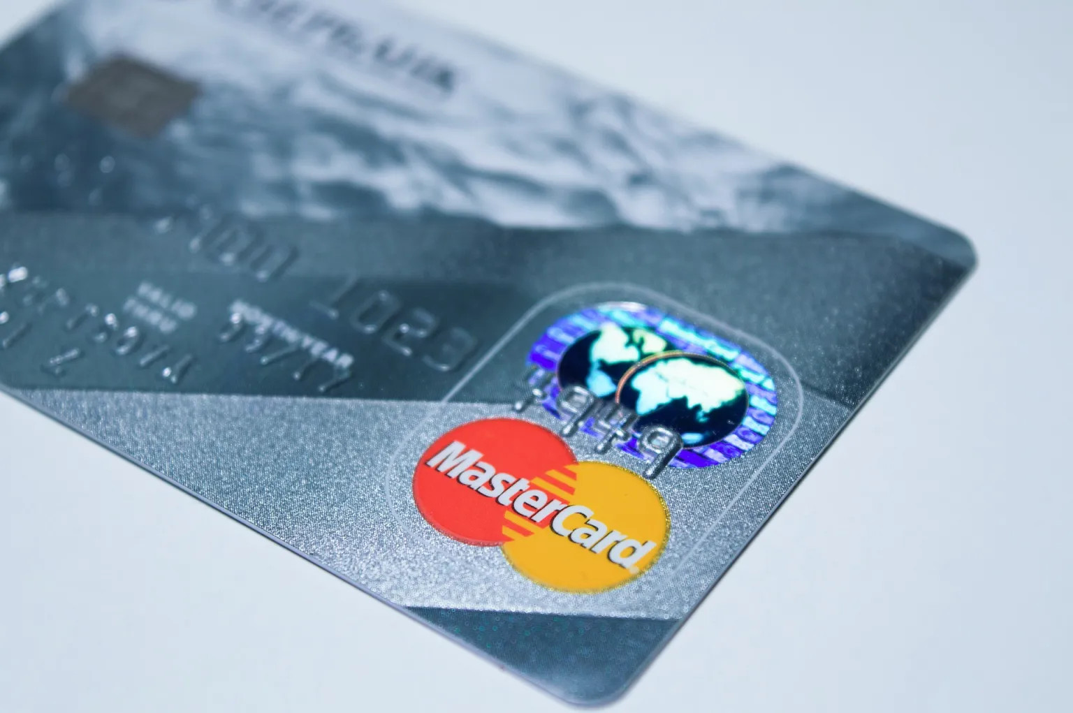
7. Vesica Pisces
The Vesica Pisces, or “bladder of the fish,” is the symbol of the Water sign Pisces, the twelfth sign of the zodiac. This symbol of sacred geometry is formed with two intersecting circles that form a rudimentary womb symbol. The womb, of course, represents fertility, creation, and generation.
As a symbol of the womb, the Vesica Pisces can be quite a powerful emotional trigger for the subconscious mind, making it a successful go-to in advertising. Some corporations whose logos utilize Vesica Pisces symbolism are Mastercard, Chanel, and Kool cigarettes, Audi, and various Christian merchandise brands (e.g. the Jesus fish decal).
6. The Moon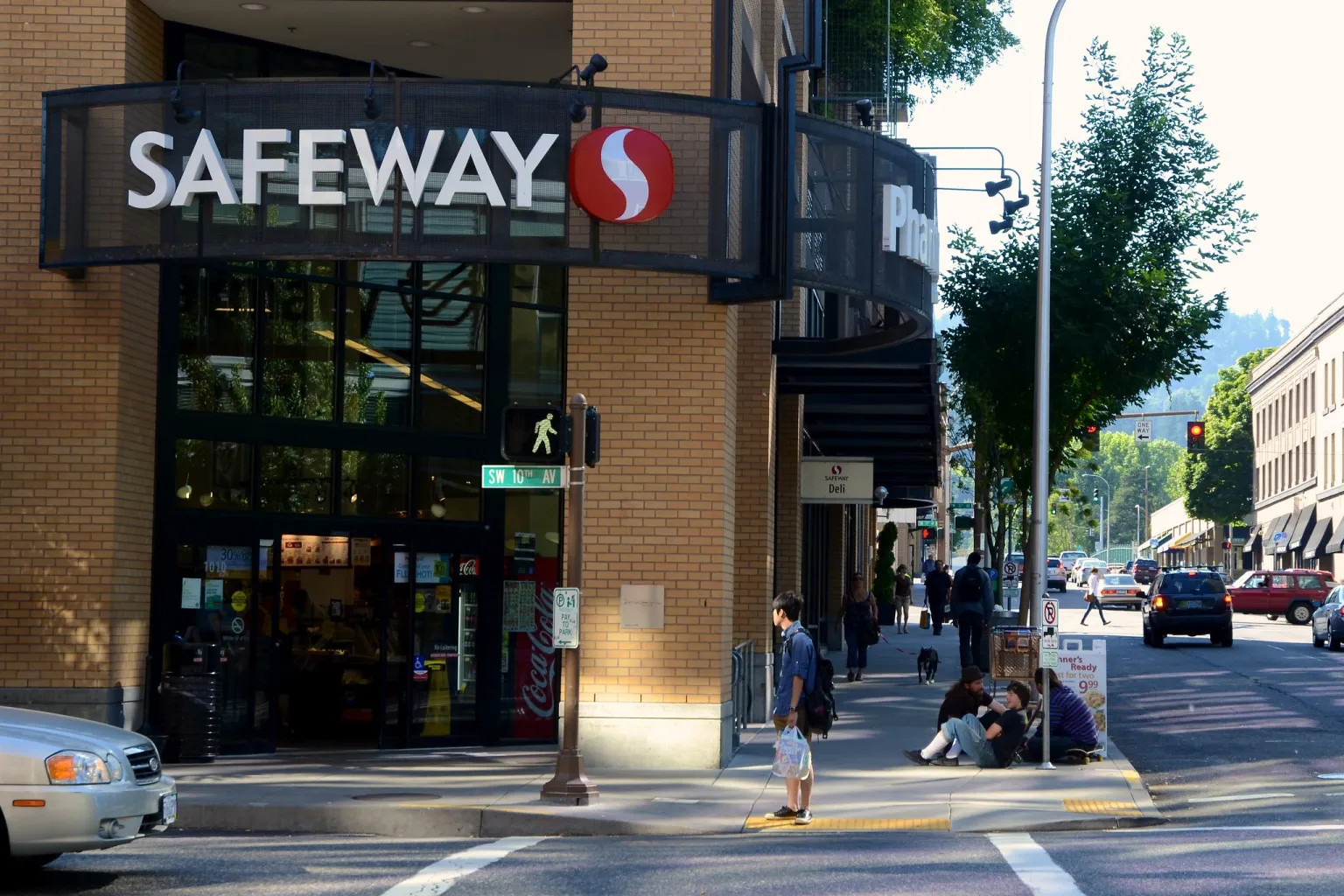
Concerning products for the home and family such as the goods that Safeway Food and Drug carry, designers need to make their brands appear safe and reliable. A great way to achieve such branding is by implementing lunar symbolism to their logos.
Cancer is the fourth house of the zodiac, ruled by the moon. The Cancer archetype is that of the nurturing caring and protective mother. In pagan traditions, she is called the goddess or the sacred feminine archetype. This zodiac sign is about the home, safety, and protection.
Taking a closer look at the Safeway grocery store logo, the outline of the Cancer symbol can be readily seen within the red portion of the logo. Another brand that uses Cancer symbolism in their branding is Blue Moon beer. The use of the word moon in this beer tells us that this is no ordinary beer; this is a fine craft beverage to enjoy within the comfort of our homes.
5. Freemasonry
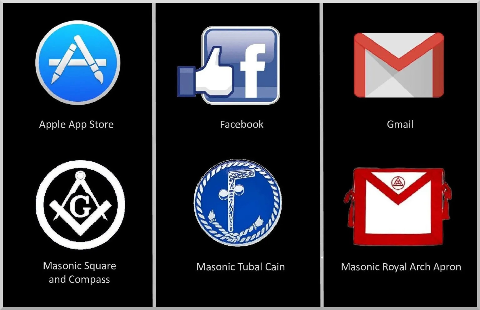
One only has to compare prominent big tech advertising with that of the Freemasons to realize the heavy masonic presence within the corporate world. The Freemasons are part of a fraternal arcane school that has beginnings in 1717 with the erection of the Grand Lodge of England.
A sacred symbol of this group is the square and compass of the architect and this symbol pops up in logos such as the Apple App Store and Acura. Upon comparison of the Facebook logo with the masons’ symbol of Tubal Cain, there are striking similarities all the way down to details such as the Facebook thumbs-up symbol and its likeness in the Tubal Cain. Gmail as well appears to be a stylized version of the Royal Arch Apron of the masons. We can also look to the names of corporations for possible associations with the masons. They refer to their work as “the craft.” Could the Heinz corporation of Kraft food brands also be involved in Freemasonry?
4. The Chakras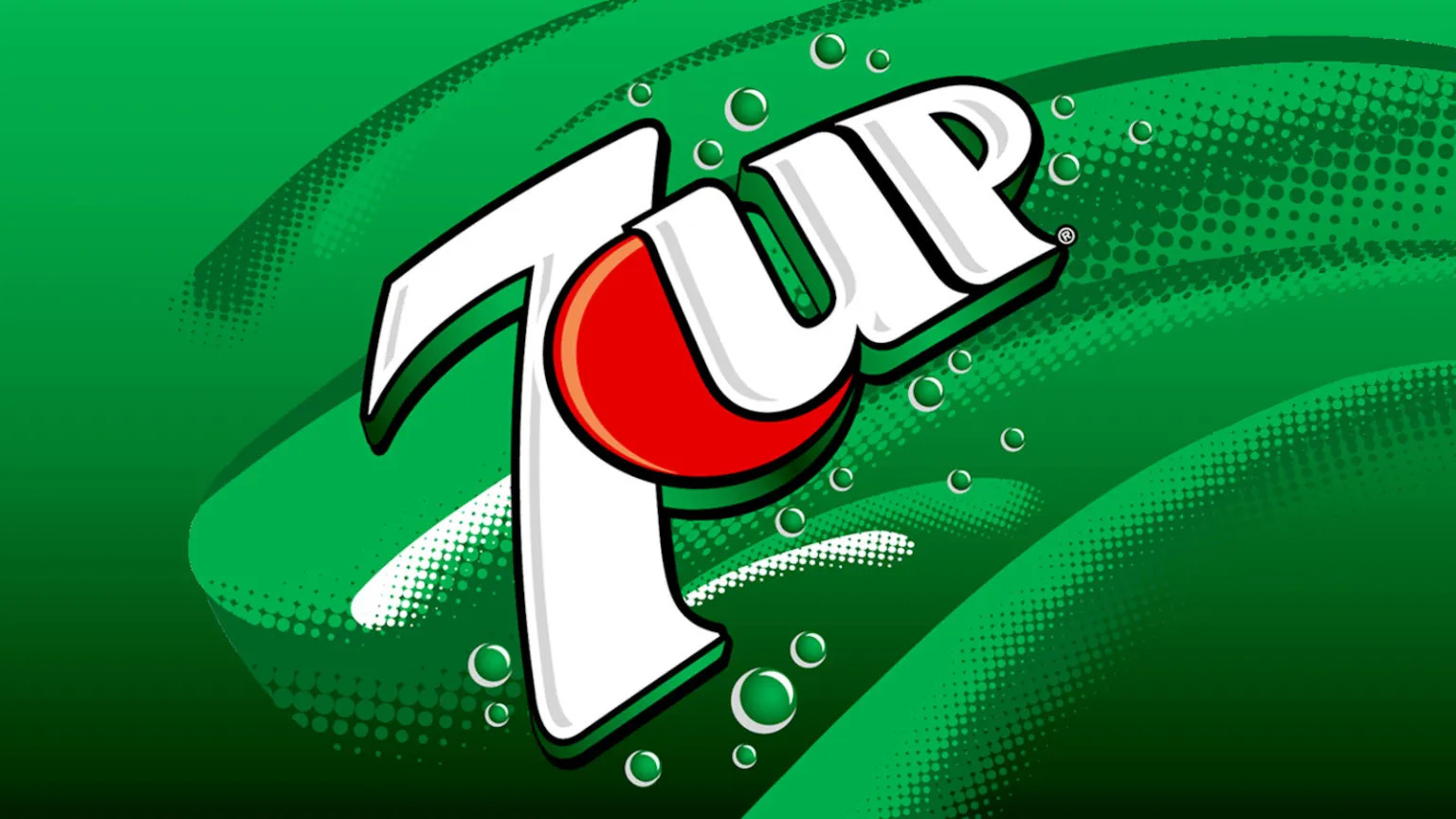
Symbolism of the Vedic chakra system shows up in corporate advertising as well. The chakra system involves seven primary energy centers along a central meridian in the body. It is thought that when these chakras are contracted or compromised, that this leads to imbalances in various aspects of being.
The refreshing fizzy drink, 7 Up, that many of us remember from childhood, may have had an esoteric reason behind its appeal. Typically, when meditating upon the 7 chakras, one begins with focus at the base of the spine and progresses up towards the crown. Hence the reason behind the smart marketing of this soda pop drink.
Each of the chakras is associated with one of the colors of the rainbow. So, in addition to using color psychology in logo design, designers often choose colors with the chakras in mind. It’s no accident that almost every fast-food chain embraces the colors red and yellow in their schemas. Not only do these colors increase appetite, but they are the colors of the lower chakras, including the stomach.
3. The Archer
 Another of the twelve zodiac signs is Sagittarius, corresponding to the archetype of the archer and the symbol of the arrow. The archer is ruled by the planet Jupiter, which leads the way towards outward growth, expansion, and change. Other qualities associated with Sagittarius are optimism, philosophical pursuits, and the desire to learn through travel and new experiences.
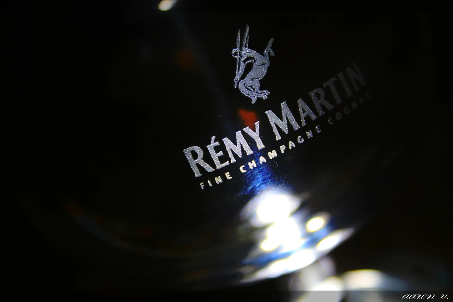
Since, the archer and the arrow are symbols of adventure and exciting travel experience, the ad people of travel agencies love using this sort of symbolism. Take a look at hotel and flight-booking businesses and notice that the more popular of these companies employ arrow symbolism. From Orbitz, Expedia, and Hotwire to Remy Martin cognac, the archer can be seen cleverly embedded within the logos, letting consumers know that they can hope to become world-travelers and philosophers themselves with these brands.
2. Saturn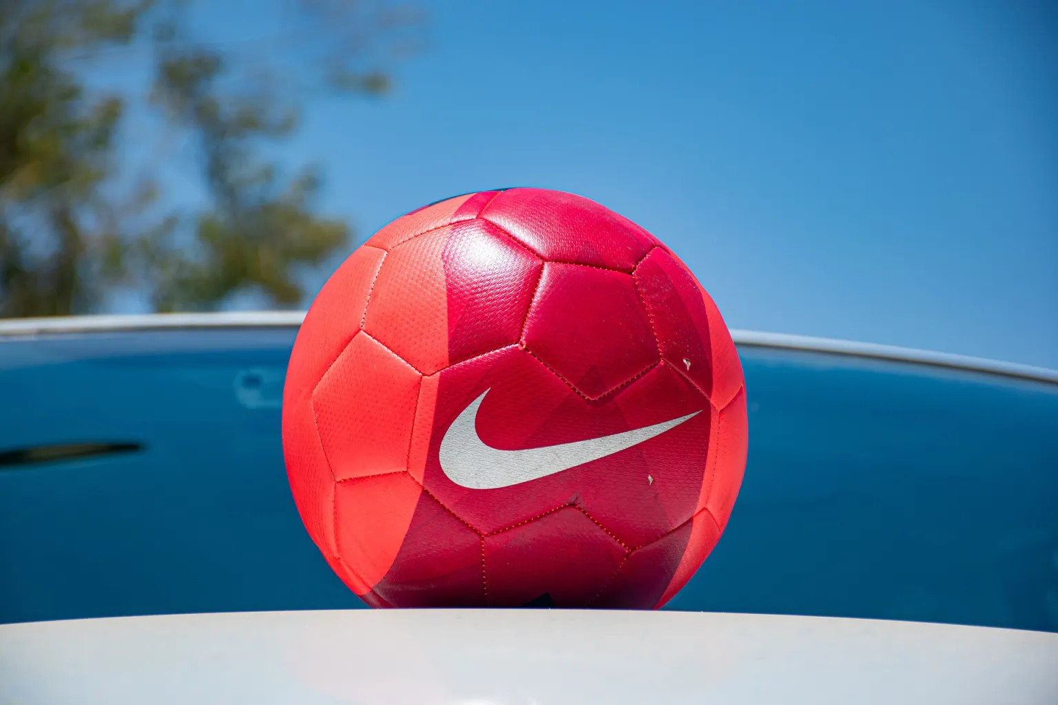
Saturn symbolism takes on a few variations in form, but that doesn’t make it any less popular in advertising. From stylized Saturn rings symbols to the more esoteric hexagon and black cube symbols, Saturn makes a heavy appearance in mainstream media. In ancient and classical esoterica of many cultural traditions, Saturn worship was prevalent in agricultural societies who both feared and eagerly awaited rewards from “the Black Sun.”
The reason that the hexagon is often associated with the planet Saturn is because there exists a permanent hexagon-shaped storm on the north pole of Saturn. The black cube is associated with this planet because a 2D image of a cube is also a hexagon shape. The absence of color is symbolic of Saturn’s governance over darker matters such as time, death, and decay.
Taking a look around at Saturnian symbolism found in corporate brands from the Saturn car, Nike, DirecTV, Internet Explorer, Capital One, Boeing, etc. (the list goes on and on), it becomes clear the the Cult of the Black Sun is alive and well in present day…not to mention the black cube monuments that are found in major cities around the globe, including the United Nations worship center.
1. The Sun
Of the most powerful symbolism known to corporate marketing departments is solar symbolism. This is because the sun represents humankind’s highest desires— energy, spirituality, sovereignty, and Truth. Corporate industries that use solar symbolism to their advantage range from banking, shopping centers, food, beer, oil, and more.
Food and oil companies, in particular, love using symbolism of the sun. Food and grocery store brands such as Dole and ShopRite use the sun in their logos because the sun reminds us of the energy needed for their plant-based products to thrive. Oil brands such as Sunoco, Shell, and BP Oil all use solar symbolism as it is suggestive to customers of the energy they will receive at the pump
Another popular market for solar symbolism is beer. Many beers promote themselves with the concept of light (e.g. Bud Light). Rather than use words such as diet, or low-carb, these brands deliberately display the word Light atop their golden beverages to convey to consumers that they could expect to receive some enlightenment with their products.